If you’d like to refresh the appearance of your online store’s checkout page quickly, you can navigate to the CheckoutWC > Appearance and choose your preferred Checkout Template. On this page, you can also customize the Design options of the chosen template to make sure it really highlights your store’s brand.
To get started, first let’s choose a template
Templates
On the Template tab, you can find and choose among the five available options, each of which can be activated by hovering over the template and clicking Activate.
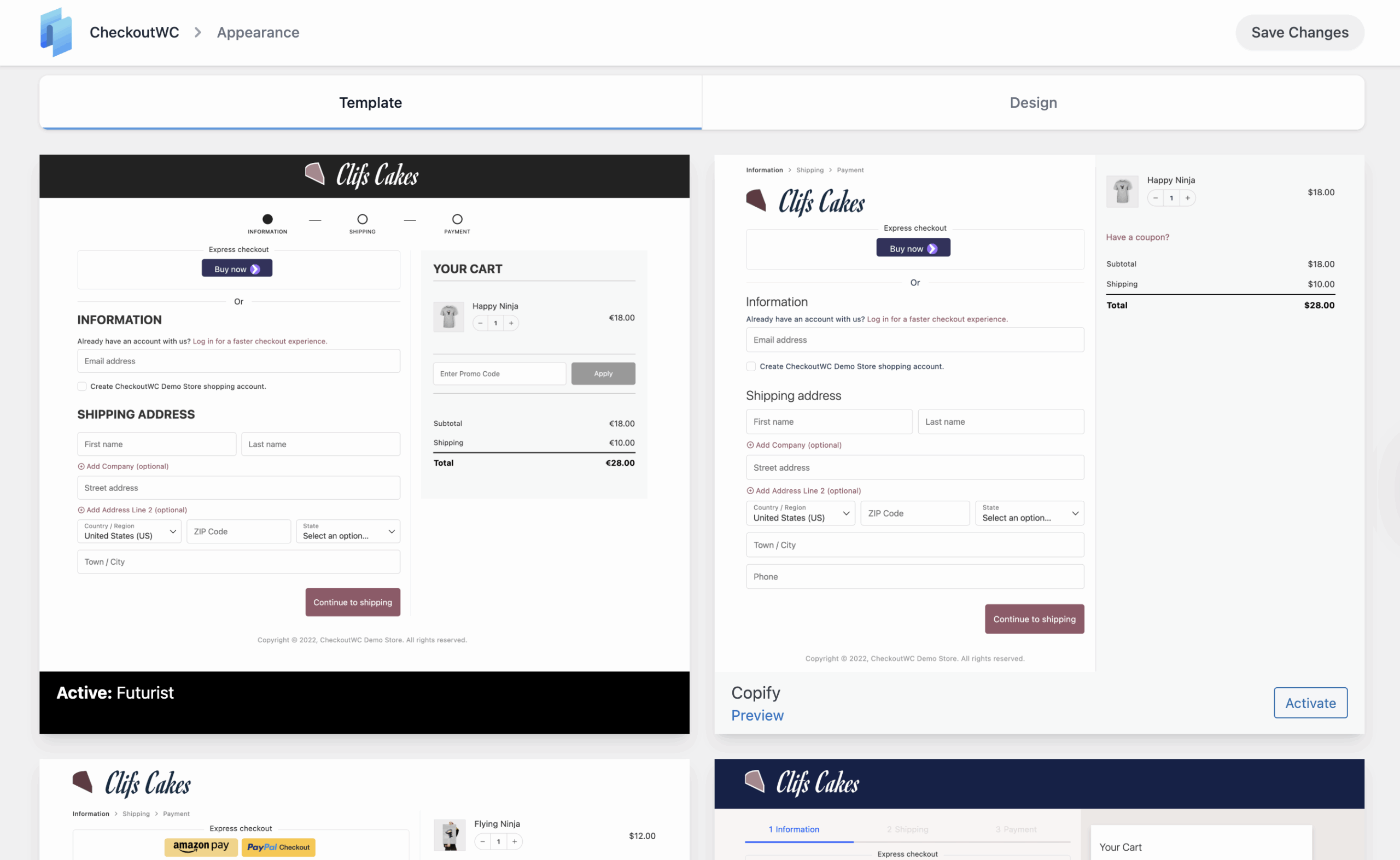
The list of available templates is:
- Futurist
- Copify
- Midas
- Glass
- Groove
On this page, you can also preview a checkout template before activating it for your online shop by hovering over a template and clicking on the Preview button. This will allow you to ensure you’re making the best possible choice before displaying it to your customers.
After choosing a template, it’s time to change its appearance to give it a unique feeling for your shop.
Design
If you click on the Design tab of the Appearance page, you can find all the available design options to customize the look and feel of the checkout theme.
Note: You can use the Search Fields…field on the top of the page to filter the settings based on what you’re looking to customize.
The settings are divided into the following sections:
General Template Settings
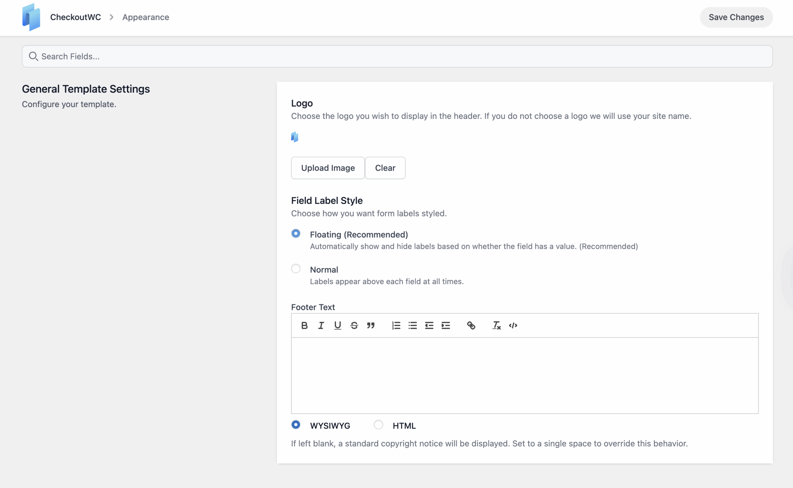
Logo
Setting a logo is optional, however, if no logo is added, your site’s title found in the Settings -> General page will be used instead.
Field Label Style
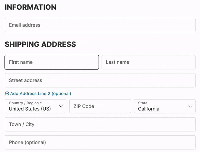
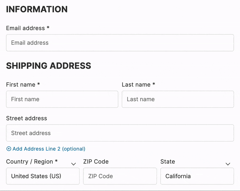
You can choose how you’d like the label of the checkout fields when using a CheckoutWC template. Currently, there are two options:
- Floating (Recommended)
This option will automatically move the label of the checkout fields to the top of the field, as shown below:
- Normal
This option will add the classic checkout field label, which appears over the field and persists even after a value is entered.
Footer Text
By default, a standard copyright notice is displayed in the footer. If you would like to customize this text, you can enter your own text in the Footer Text field. Currently, there are two formats you can use to enter the footer:
- WYSIWYG (default method)
- HTML
After you’ve configured the general template settings, it’s time to choose the typography.
Typography
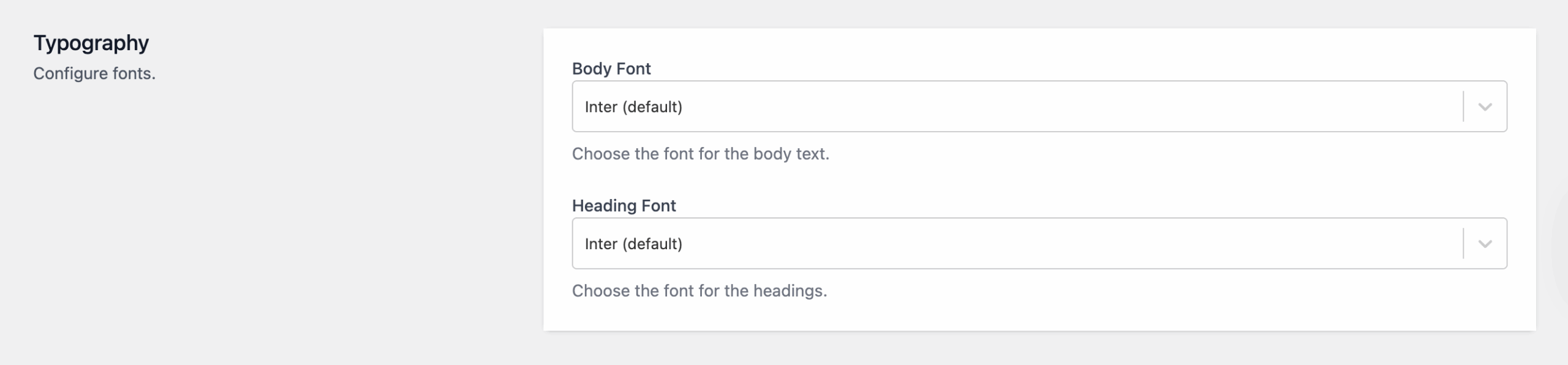
In this section, you can configure which font you’d like to be used for the template’s body and heading. You can choose one of the fonts pre-loaded within CheckoutWC, or you can even use your custom checkout font if you’d prefer that.
Colors
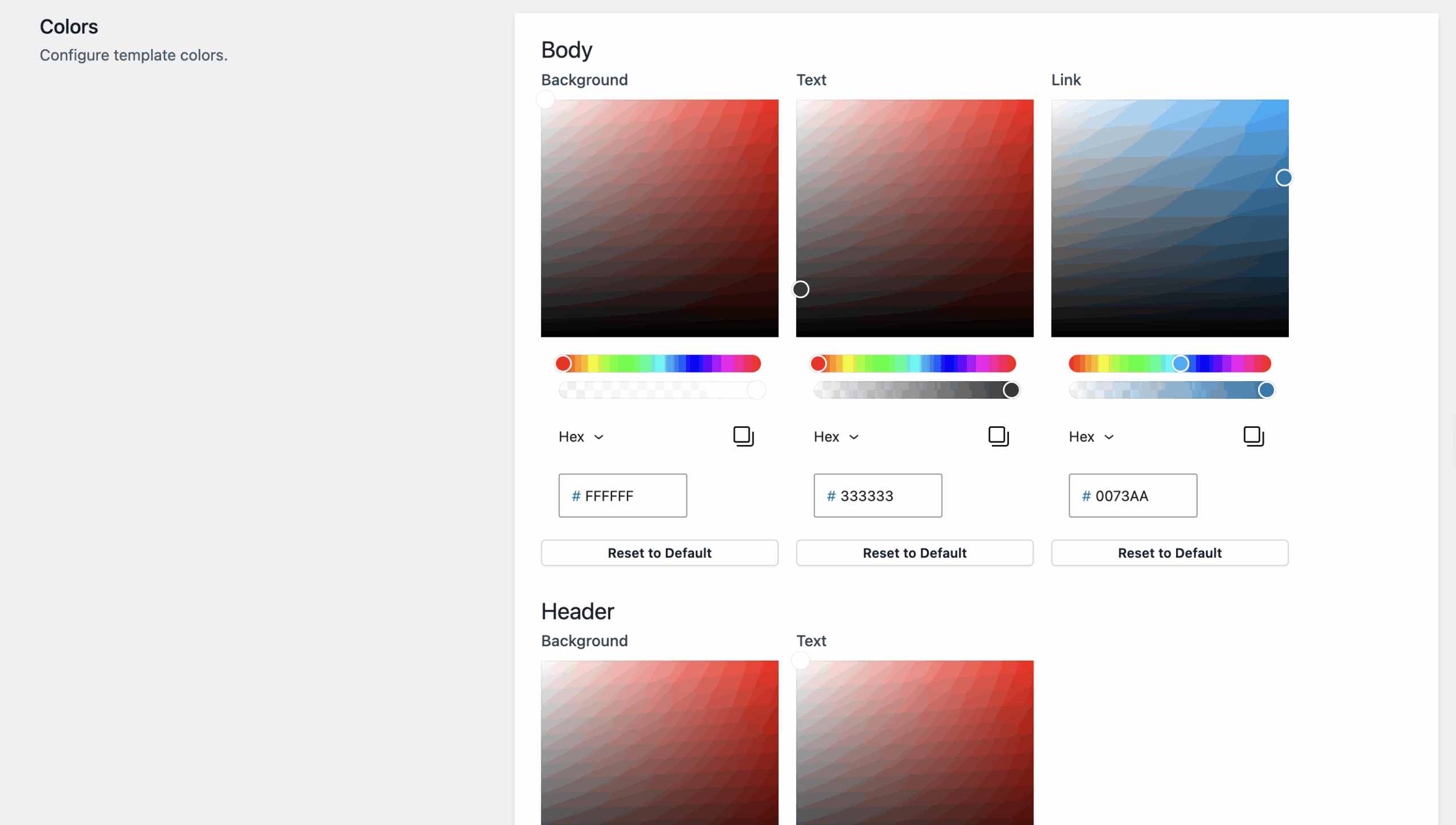
You can also change the colors for various elements of the template. More specifically, the:
-
- Body’s background, text, and link colors.
- Header’s background and text colors.
- Footer’s background and text colors.
- Cart Summary’s background, text, link, mobile background, quantity bubble background, and quality bubble text colors.
- Breadcrumb’s completed, current, and next text and accent colors.
- Buttons’ primary and secondary background, text, and background, text hover colors.
CSS
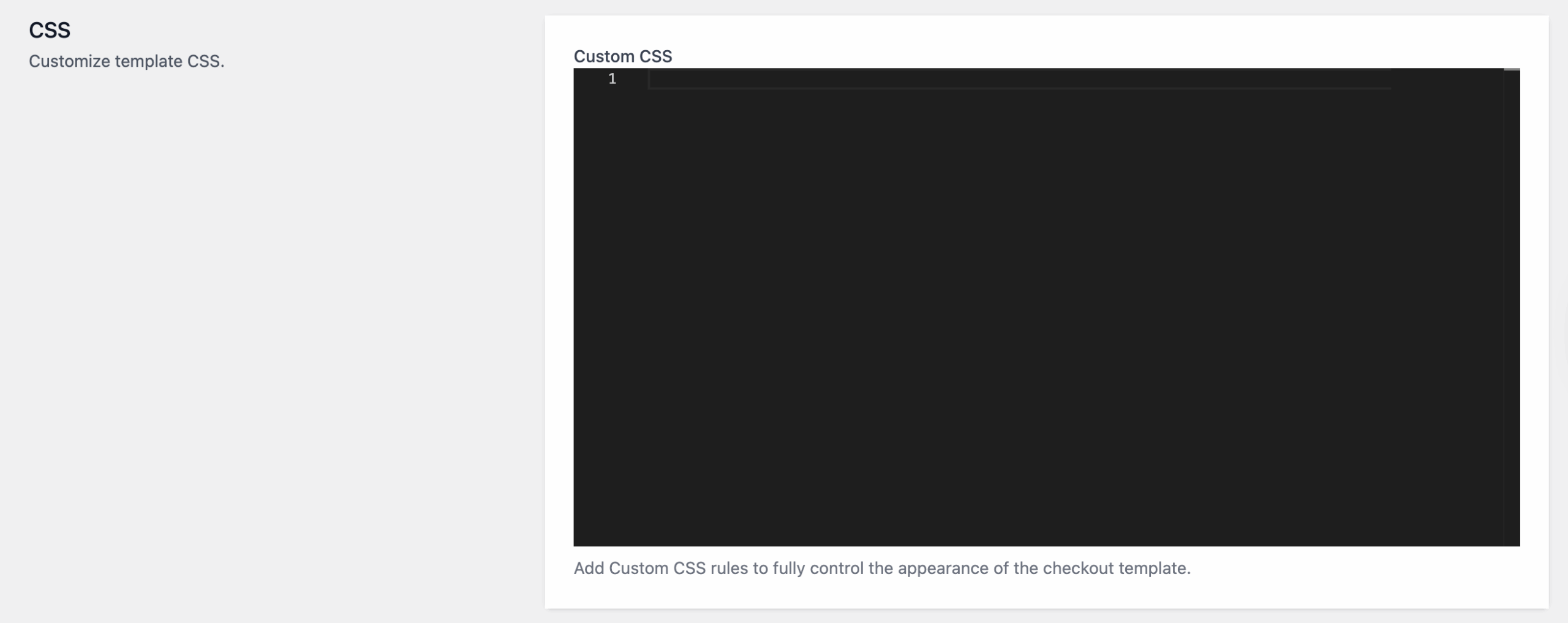
You can enter custom CSS styles in the Custom CSS text box.
CSS can be directly entered, meaning you do not have to wrap styles in a <style> tag.
After making all the needed changes, don’t forget to click on the Save Changes button in the upper-right corner of the page for all the changes to be applied.