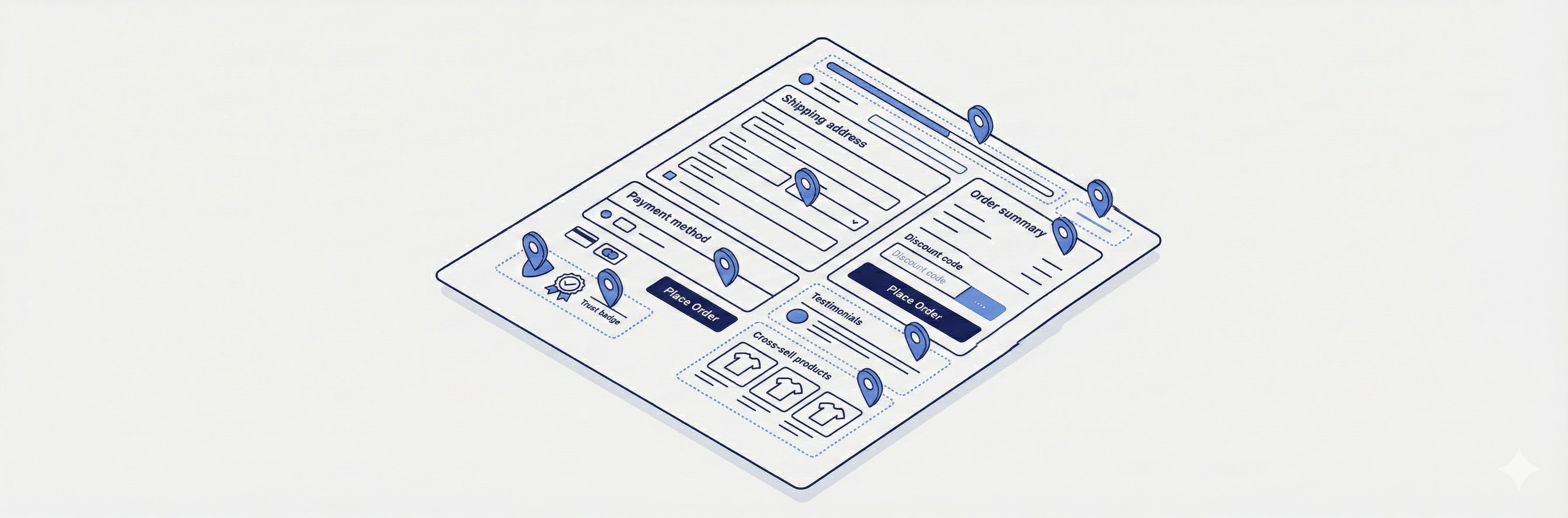
CheckoutWC lets you display WooCommerce order bumps in multiple locations throughout the checkout flow. Where you place a bump affects how customers perceive the offer and how likely they are to accept it. This guide covers every available location, how the legacy pre-v11.2.0 location names map to today’s naming, and how to control how many bumps appear at once.
The Display Location field
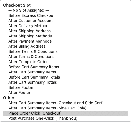
Every Order Bump has a Display Location field in its editor, on the Display Location panel in the sidebar. The dropdown is split into two groups:
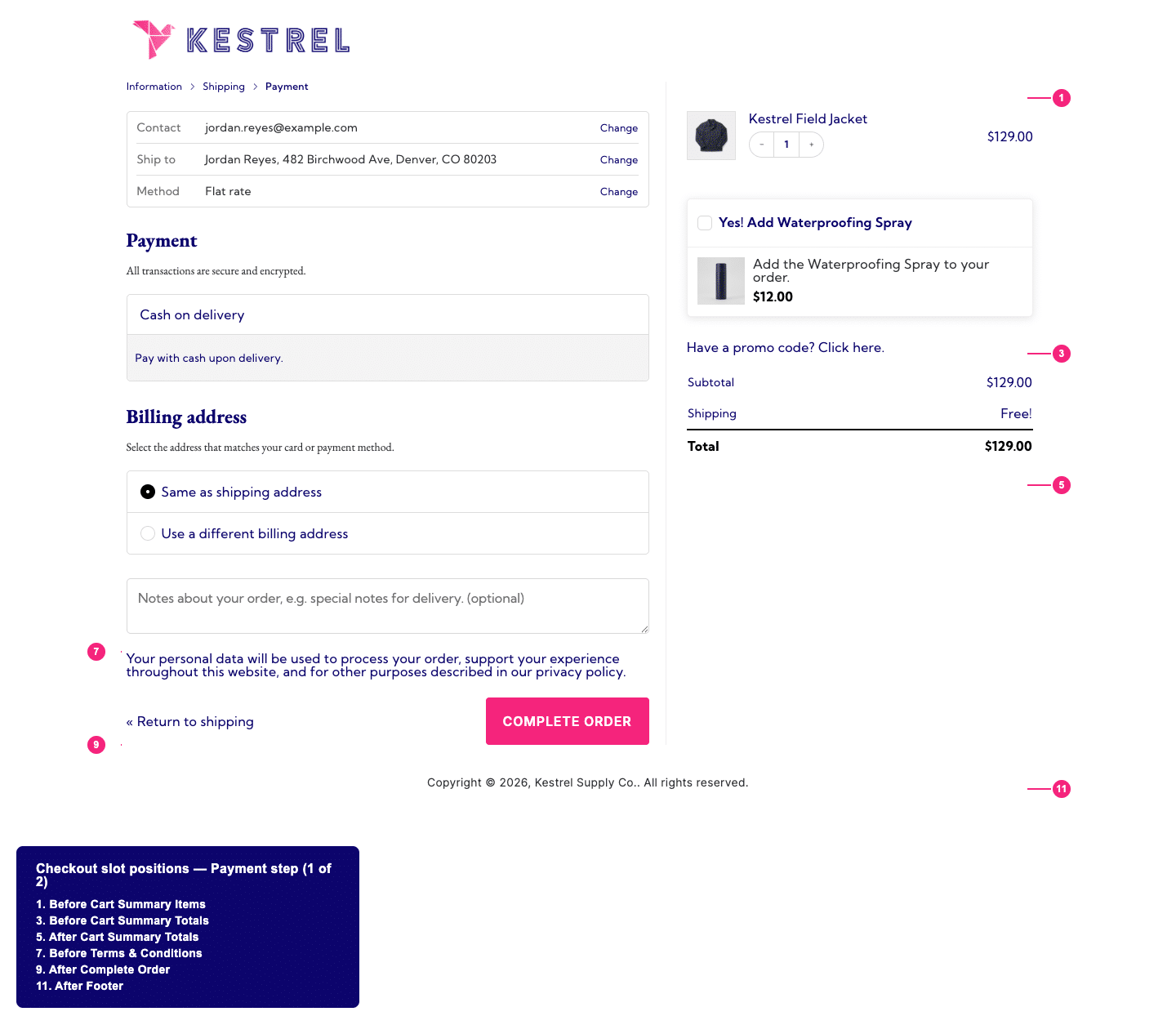
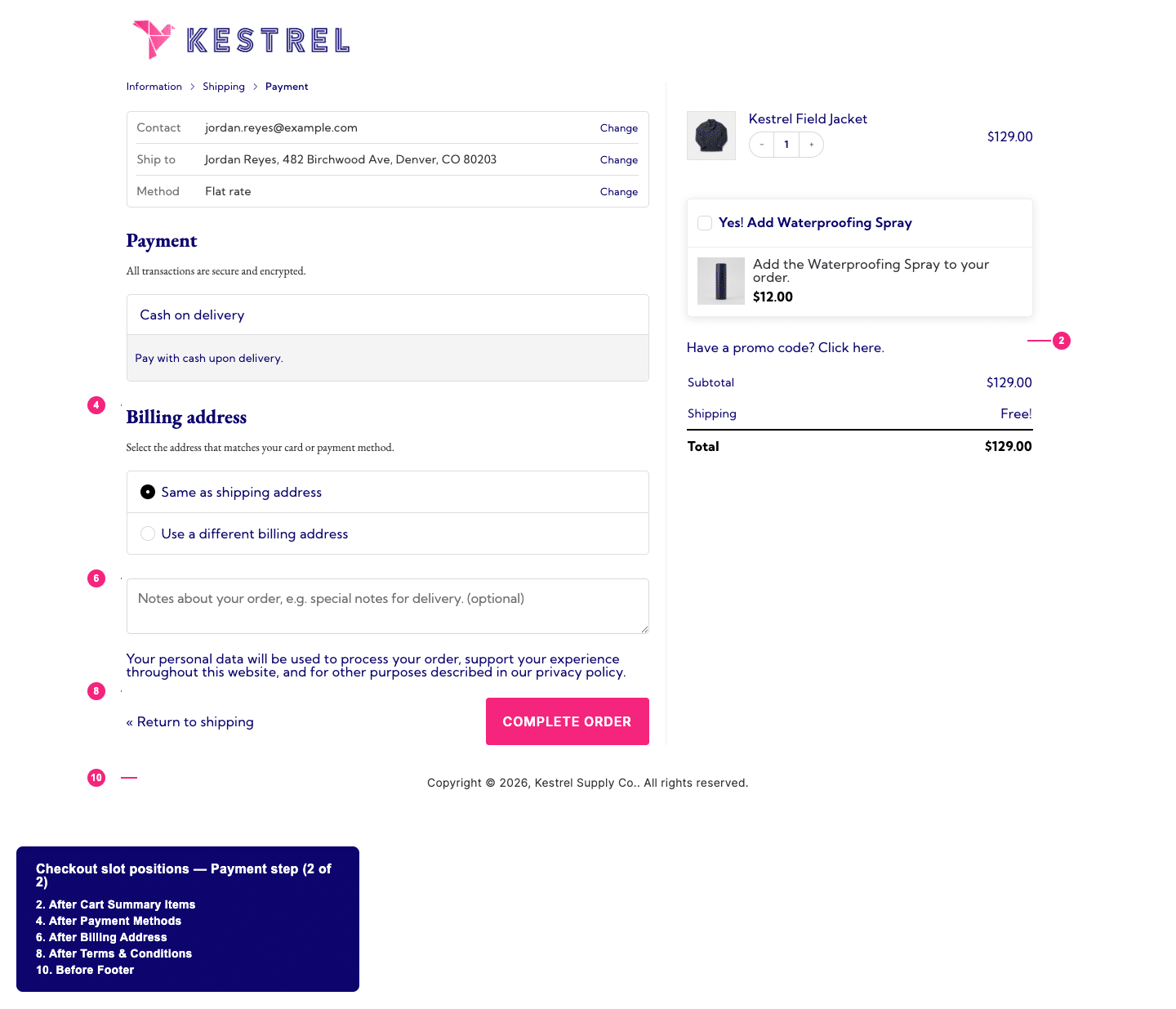
- Checkout Slot — 16 fixed positions built into the checkout page itself, described below.
- Other — 4 locations that render outside the checkout-slot system: the Side Cart, the Place Order modal, and the post-purchase Thank You page.
Important: the dropdown’s first option is — No Slot Assigned —, which is also the default for a brand-new bump. Publishing is not blocked if you leave it there — the field has no required-value check — and a bump left on — No Slot Assigned — does not fall back to any other location. It publishes successfully but never displays anywhere on checkout. If a bump you created isn’t showing up, check this field first.
Checkout Slot locations
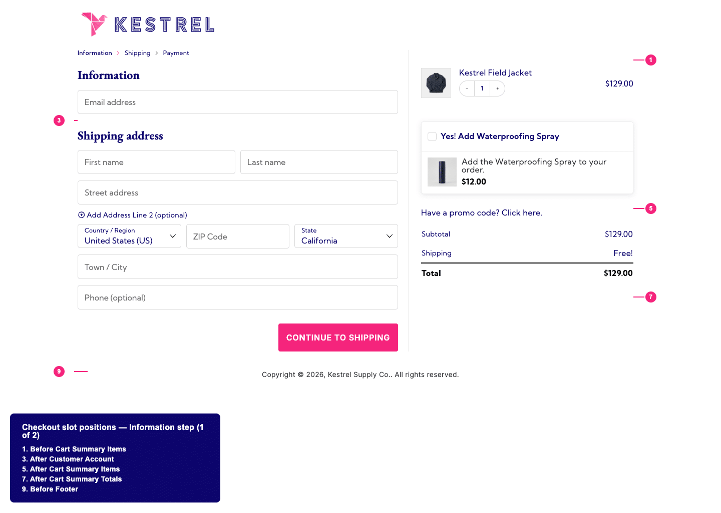
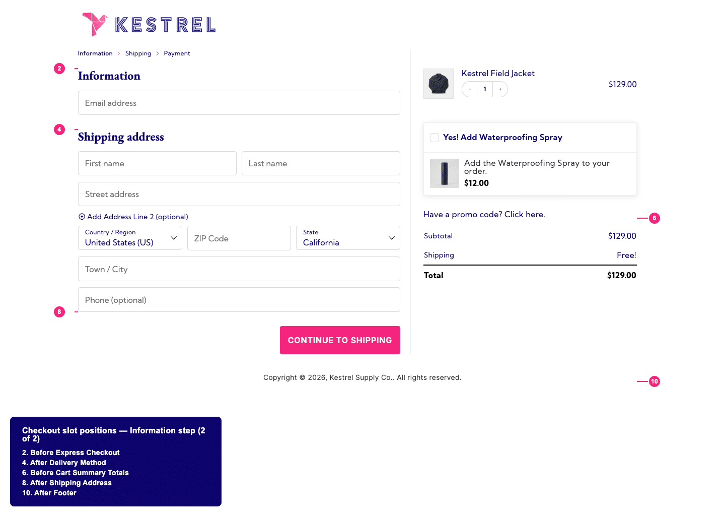
These 16 locations are tied to specific sections of the checkout form. They’re listed below in the order they appear on the page, top to bottom.
| Location | Appears |
| Before Express Checkout | Above the express payment buttons (Apple Pay, Google Pay, PayPal, etc.) at the top of checkout |
| After Customer Account | Directly below the account/login fields |
| After Delivery Method | Below the delivery method selector, before the address fields |
| After Shipping Address | Below the shipping address fields |
| After Shipping Methods | Below the shipping method selector |
| After Payment Methods | Below the payment method selector |
| After Billing Address | Below the billing address fields |
| Before Terms & Conditions | Just above the terms checkbox and Complete Order button |
| After Terms & Conditions | Just below the terms checkbox, still above the Complete Order button |
| After Complete Order | Below the Complete Order button |
| Before Cart Summary Items | Above the line items in the order summary |
| After Cart Summary Items | Below the line items in the order summary, above the totals |
| Before Cart Summary Totals | Above the subtotal/total lines in the order summary |
| After Cart Summary Totals | Below the subtotal/total lines in the order summary |
| Before Footer | Above the checkout page footer |
| After Footer | Below the checkout page footer |
Before Express Checkout
Displays the bump above express payment buttons, before customers enter any checkout information.
Best for: high-value offers you want every customer to see immediately, or time-sensitive promotions. Use sparingly since it adds friction before customers start checkout.
Before Terms & Conditions
Places the bump just before the terms checkbox and payment button — one of the last things customers see before completing their purchase.
Best for: warranties, protection plans, and other “peace of mind” offers. The placement creates a natural pause before the final commitment.
After Shipping Address / After Shipping Methods
These two replace what older versions of this doc called “Bottom of Information Step” and “Bottom of Shipping Step.” After Shipping Address shows once the customer has entered their address; After Shipping Methods shows once they’ve picked a shipping method.
Best for: offers that relate to shipping or delivery — gift wrapping, shipping upgrades, or delivery add-ons — since customers are already thinking about how their order will arrive.
After Complete Order
Places the bump underneath the final Complete Order button. Customers see it after scrolling past all checkout fields.
Best for: last-chance offers or low-commitment add-ons. This position is less prominent but can work for impulse purchases that don’t need much explanation.
Side Cart and other locations
These four locations sit outside the checkout-slot system — they don’t correspond to a fixed position in the checkout form.
| Location | Where it shows |
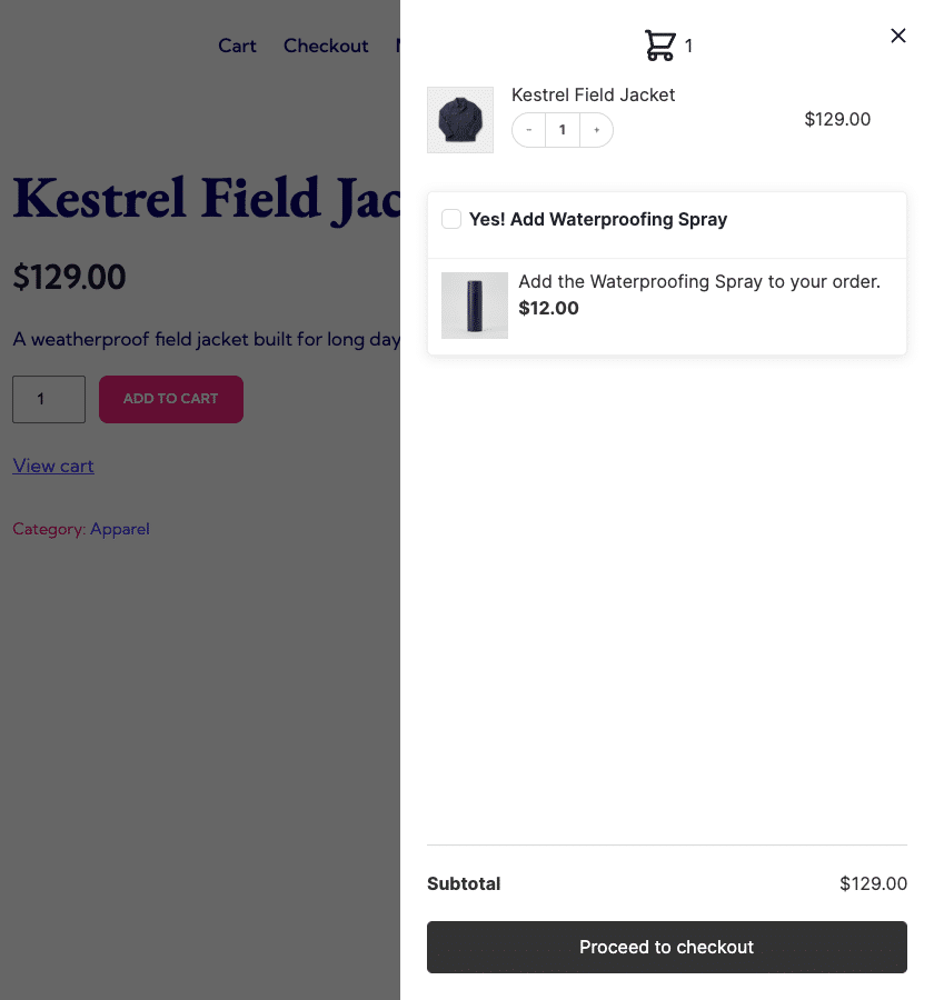
| After Cart Summary Items (Checkout and Side Cart) | Below the cart items, in both the checkout page order summary and the Side Cart drawer |
| After Cart Summary Items (Side Cart Only) | Below the cart items, in the Side Cart drawer only |
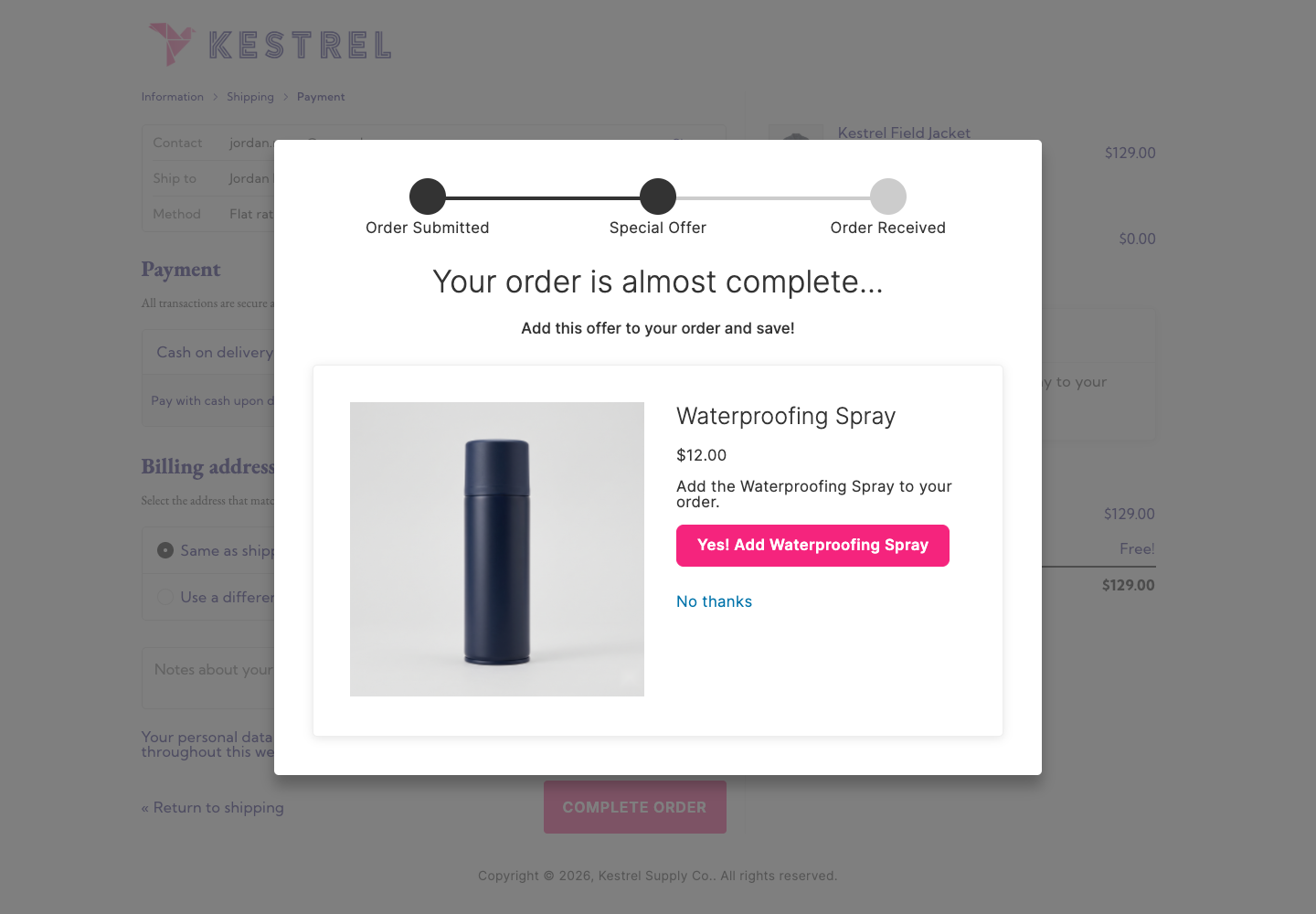
| Place Order Click (Checkout) | In a modal popup that appears when the customer clicks Complete Order, before payment is submitted |
| Post Purchase One-Click (Thank You) | On the order confirmation (Thank You) page, after payment succeeds |
After Cart Summary Items (Checkout and Side Cart)
Displays the bump directly under the cart item list, on both the checkout page and in the Side Cart drawer. This is the most general-purpose location and works well for most offers because customers naturally scan down from their cart contents.
Best for: complementary products, accessories, add-ons. A good starting point when you’re not sure which location to use.
Note: on smaller screens, bumps assigned here move to a combined mobile container that renders near the terms and conditions area instead of their normal position in the order summary sidebar — the sidebar itself is hidden below that breakpoint on mobile checkout layouts.
After Cart Summary Items (Side Cart Only)
Same placement, but only shown in the Side Cart drawer — the sliding panel that appears when customers add an item or click the cart icon. It never appears on the checkout page itself.
Best for: quick add-ons and impulse purchases. Customers browsing the Side Cart are still in shopping mode, not checkout mode, so simpler offers tend to perform better here.
Place Order Click (Checkout)
Displays a modal popup immediately after the customer clicks Complete Order but before payment processes. The customer can accept or decline the offer, then their order (with or without the bump) processes normally. This location works with any payment gateway.
Best for: high-margin add-ons, limited-time offers, or products that pair directly with what they just bought. The timing creates urgency without interrupting the checkout flow.
Note: customers can always decline and complete their original order — the bump is optional.
Post Purchase One-Click (Thank You)
Displays the bump on the order confirmation page after payment succeeds. Customers can add the offer to their existing order with a single click, without re-entering payment details.
This location tends to convert well because there’s no friction — the customer has already paid and adding the offer takes one click.
Requires a compatible payment gateway. Gateway support for one-click charging is registered by the gateway plugin itself, not by CheckoutWC — CheckoutWC ships with no gateways pre-registered for this feature. As of this writing, Payment Plugins for Stripe and Payment Plugins for PayPal are the gateway plugins that register support. If you’re using a different gateway (including WooCommerce’s own core Stripe/PayPal gateways), the bump won’t display, and the bump editor shows a warning when the current site has no registered gateway. See Supported payment gateways for post-purchase one-click order bumps for setup instructions and how to request support for your gateway, or use the Place Order Click location instead.
Best for: complementary products, subscription upgrades, or exclusive offers for new customers.
For a complete setup guide, see Post-purchase one-click order bumps.
If you’re upgrading from an older version
CheckoutWC 11.2.0 rewrote how checkout-page bump locations work (the “checkout-slot” system) and renamed most of them. If you have bumps that were placed before upgrading, they still display correctly — the plugin transparently maps each old location to its current equivalent at render time. Nothing breaks, but the naming in the bump editor’s dropdown won’t match what you remember.
| Old name | Current equivalent |
| Above Express Checkout | Before Express Checkout |
| Bottom of Information Step | After Shipping Address |
| Bottom of Shipping Step | After Shipping Methods |
| Above Terms and Conditions | Before Terms & Conditions |
| Below Complete Order Button | After Complete Order |
| Below Cart Items (Checkout Only) | After Cart Summary Items (this is a Checkout Slot location, distinct from the “Other” group’s After Cart Summary Items (Checkout and Side Cart) below) |
Not affected by this migration: “Below Cart Items” and “Below Cart Items (Side Cart Only)” were never retired — they’re the same stored values as today’s After Cart Summary Items (Checkout and Side Cart) and After Cart Summary Items (Side Cart Only). Only their on-screen labels changed.
One side effect worth knowing about: opening an older bump’s Display Location panel won’t show any option as selected, since the old location name isn’t in the current dropdown’s list — even though the bump is rendering correctly on the frontend. To clear this up, just pick the current-name equivalent from the table above and re-save; it won’t change where the bump displays.
Controlling how many bumps display
By default, CheckoutWC limits bumps to prevent overwhelming customers. You can adjust these limits at CheckoutWC > Order Bumps > Settings:
Maximum Order Bumps Per Slot
The maximum number of order bumps displayed in each checkout slot. Default is 10. Set to -1 for unlimited.
Maximum Place Order Bumps
The maximum number of modal bumps shown after clicking Complete Order. Default is 1. Set to -1 for unlimited, though showing multiple modals in sequence may frustrate customers.
If more bumps qualify for the same location than the maximum allows, CheckoutWC displays them in ascending Order value — the numeric field WordPress adds to the bump editor’s Page Attributes panel. Bumps you haven’t set an explicit order on default to 0.
Choosing the right order bump location
A quick reference for matching offer types to locations:
| Offer type | Recommended location |
| Complementary accessory | After Cart Summary Items (Checkout and Side Cart) |
| Warranty or protection | Before Terms & Conditions |
| Free gift at a spend threshold | After Cart Summary Items (Checkout and Side Cart) |
| Quick impulse add-on | After Cart Summary Items (Side Cart Only) |
| High-margin upsell | Place Order Click (Checkout) or Post Purchase One-Click (Thank You) |
| Subscription upgrade | Post Purchase One-Click (Thank You) |
| Shipping-related add-on (gift wrapping, shipping upgrade) | After Shipping Methods |
When in doubt, start with After Cart Summary Items (Checkout and Side Cart). It’s the most versatile location and performs well for most offer types. Once you have baseline data, experiment with other locations to see what converts best for your specific products and audience.
Related resources
- Creating your first order bump
- Rules Engine reference for targeting specific customers
- Post-purchase one-click order bumps
- Supported payment gateways for post-purchase one-click order bumps
- Order Bumps overview for complete settings reference
Need help?
Not sure which location is right for your store? Contact our support team and we can help you decide based on your products and checkout flow.