E-commerce Checkout Best Practices for Higher Conversions
Table of Contents
- Don't ask for unnecessary information
- The CheckoutWC solution
- Provide smart form filling
- Browser autofill
- Address automation
- The CheckoutWC solution
- Provide a guest checkout option
- The CheckoutWC solution
- Optimize form validation and errors
- The CheckoutWC solution
- Ensure easy-to-find contact information
- Channel preferences by urgency
- Proactive chat triggers that convert
- Optimize for mobile first
- The CheckoutWC solution
- Decide how many steps your checkout flow needs
- The CheckoutWC solution
- Use checkout progress indicators to guide checkout
- The CheckoutWC solution
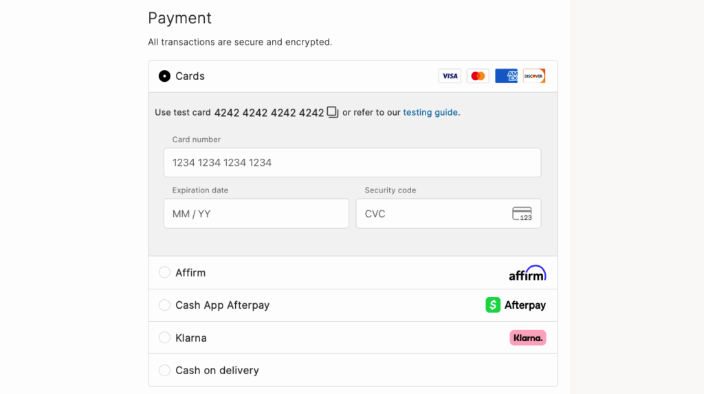
- Offer multiple payment options
- The CheckoutWC solution
- Display trust badges
- The CheckoutWC solution
- Improve cart management and abandonment
- The CheckoutWC solution
- Take your checkout optimization to the next level
You’ve invested thousands in marketing. Your traffic metrics look fantastic. Yet your sales numbers tell a different story.
The culprit? Your checkout process.
Your checkout flow is the final stretch between “add to cart” and “order complete,” where interested visitors become paying customers. A poorly optimized checkout causes cart abandonment rates to soar (averaging 70% across all industries) while your revenue flatlines.
Here’s the harsh truth: Every day you delay checkout optimization is money left on the table.
This guide delivers battle-tested strategies to transform your checkout from a conversion killer to a revenue generator. You’ll discover how to:
- Eliminate unnecessary form fields that frustrate customers.
- Create a frictionless user experience that guides buyers to completion.
- Build trust with strategic security signals and payment options.
- Recover abandoned carts before they’re lost forever.
- Implement everything quickly with CheckoutWC‘s all-in-one optimization toolkit.
Ready to stop watching potential sales slip away?

The simplicity of Shopify with the power of WooCommerce. Replace your WooCommerce checkout page with CheckoutWC to boost sales and reduce cart abandonment.
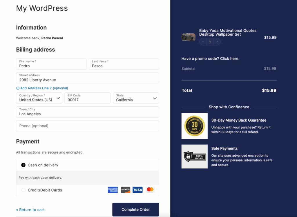
Don’t ask for unnecessary information
Form field bloat is a conversion killer. Each unnecessary field increases the chance that a customer abandons their purchase.
The golden rule: If you don’t need it to process the order, don’t ask for it.
Following this rule, we can divide checkout information into required fields and unnecessary fields:
| Required fields | Unnecessary fields |
| Email address for order confirmation and updates | Phone number (unless shipping requires it) |
| Billing address for payment verificaition | Date of birth |
| Shipping address for product delivery | Company name (for B2C stores) |
| Payment details for transaction processing | Fax number (seriously, it’s 2025) |
Okay, so what do you do after you’ve cut your fields down to the essentials? Here are some tips:
- Use progressive disclosure to show fields only when needed. A customer buying a digital product? Skip the shipping address entirely. Selecting “ship to billing address”? Hide those duplicate fields instantly.
- Take advantage of visual hierarchy. Mark optional fields clearly with “(optional)” text. Better yet – move them to a collapsed “Additional Information” section.
- Earn trust by being transparent. When you must collect specific information, explain why:
- “ZIP code (for calculating shipping)”
- “Phone (carrier may contact for delivery)”
- Perform regular audits to keep forms lean. Every quarter, review your checkout analytics and ask: “Which fields have the lowest completion rates?” Those are your first candidates for removal (unless they’re essential).
The CheckoutWC solution
You choose exactly what shows up in your forms:
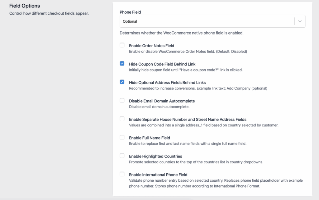
Want to hide the phone number field or replace the first and last name with a full name field? All in your control. You can also hide the billing address for free orders and shipping information for digital and virtual products. Clean up the clutter in just a few clicks.
Provide smart form filling
Smart form filling is a technology that automatically completes checkout fields, reducing manual typing and errors.
This includes browser autofill optimization and address automation. Here’s how you can implement both:
Browser autofill
First, you need to remember that browser autofill works when form fields use standard naming conventions – not ideal for creativity, but important for convenience. Use exact attributes:
- autocomplete=”email”
- autocomplete=”cc-number”
- autocomplete=”address-line1″
These go directly in your HTML input fields. For example:
<input type=”email” name=”email” autocomplete=”email”>
<input type=”text” name=”address” autocomplete=”address-line1″>
Your ecommerce platform or developer adds these to your checkout form’s code.
Address automation
Google Address Autocomplete transforms address entry from five fields to one search box. Customers type “123” and instantly see “123 William Street, New York, NY, USA” as a selectable option.
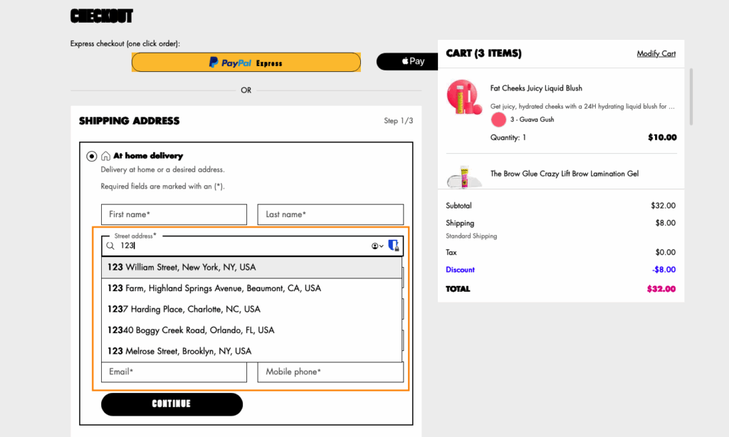
To make things even easier, use geolocation to create smart defaults:
- Pre-select the customer’s country.
- Display prices in local currency.
- Format phone numbers correctly.
- Show relevant payment methods.
The CheckoutWC solution
CheckoutWC includes Google Address Autocomplete automatically.
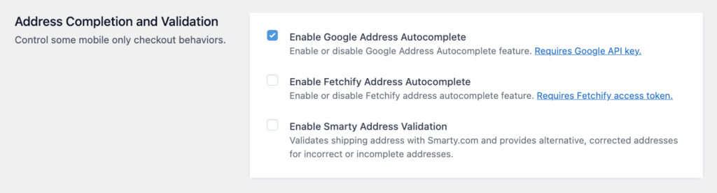
It’s powered by Google Places API and Fetchify, and it’s very simple to implement: Just enable and add the Google Address API key or the Fetchify access token.
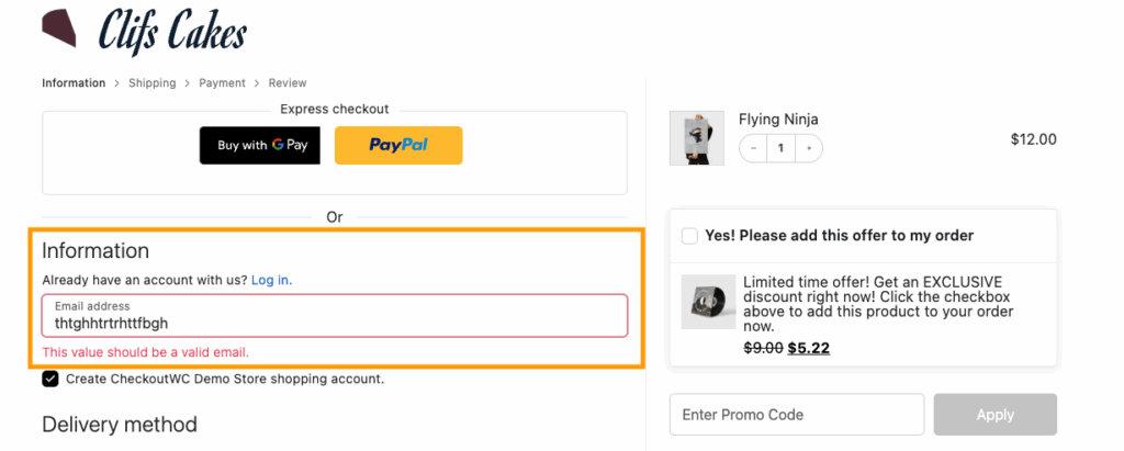
Provide a guest checkout option
Guest checkout is a purchase option that lets customers buy without creating an account – an option that is more important than you think. 26% of shoppers abandon their carts when forced to register, and it’s no wonder why:
- They’re already managing 100+ passwords.
- They worry about spam emails.
- They want to buy NOW, not fill out more forms.
- They fear their data being sold.
So what do you do? Just show them the benefits of doing the opposite.
For example, place these options side-by-side:
| Guest checkout | Create account |
| “Checkout as Guest” | “Save time on future orders” |
| (Primary button styling) | (Secondary button styling) |
| No asterisks or requirements | Show optional benefits |
Still capture email for order updates – just frame it correctly:
- ❌ “Email address (required for account)”
- ✅ “Email address (for order updates)”
Single biggest mistake? Hiding guest checkout behind tiny links or making customers hunt for it.
You can also offer account creation after a successful checkout when customer satisfaction peaks.
“Your order is confirmed! Create an account in 10 seconds to:
- Track your shipment
- Access order history
- Save addresses for next time
[Create Account] [No Thanks]”
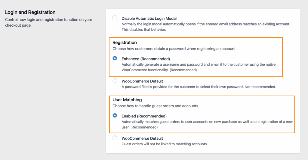
The CheckoutWC solution
CheckoutWC’s enhanced registration feature captures customer data intelligently, allowing account creation with one click using information already provided during checkout.
Optimize form validation and errors
Form validation is the process of checking user input for errors and providing feedback to fix them. There are two types – traditional and instant. Here’s the difference:
Traditional validation:
- Customer fills entire form.
- Hits submit.
- Page reloads with errors.
- Customer hunts for problems.
- Frustration builds.
Smart validation:
- Customer types information.
- Green checkmark or outline appears instantly.
- Confidence builds with each field.
Next, you need to work on your error messages. The number one rule here is that you’re specific: Instead of “Payment failed,” you should say “Card expired 03/24. Use a current card.” This way, instead of just pointing out mistakes, you’re guiding users on how to fix them.
Use visual hierarchy for errors:
- Red outline on problem field.
- Error icon inside field.
- Helpful message below.
- Keep other fields normal (don’t punish everything).
However, don’t just show what’s wrong – celebrate what’s right.
- Green checkmarks for valid fields.
- Progress bars filling up.
- “Looking good!” micro-copy.
Each positive indicator creates psychological momentum toward completion.
The CheckoutWC solution
CheckoutWC comes with real-time validation intelligence – errors appear inline as customers type. Email missing “@”? Instant notice. Card number invalid? Immediate feedback. No more submit-and-pray frustration.
Ensure easy-to-find contact information
Users need to feel supported in order to reduce anxiety at critical friction points, without leaving their purchase flow. To do this, you need to make support contacts and resources visible and positioned strategically:
| Checkout stage | Customer worry | Support placement |
| Payment entry | “Is this secure?” | Next to credit card fields |
| Shipping selection | “When will it arrive?” | Below delivery options |
| Final review | “Can I return this?” | Near order total |
The floating help button wins. Fixed position in the bottom-right corner stays visible during scrolling without blocking content.
Channel preferences by urgency
Different problems need different solutions. Use live chat for immediate issues like faulty coupons or declined payments, and email support for non-urgent questions like “Do you ship to Canada?” We also recommend including a phone line whenever possible for more complex issues or custom requirements.
Proactive chat triggers that convert
Smart triggers catch customers before they leave:
- Idle for 30+ seconds on payment page.
- Multiple failed payment attempts.
- Cursor hovering over exit button.
- Returning to previous checkout steps.
Optimize for mobile first
Mobile-first checkout design is built for smartphones as the primary device, then scales up to desktop. The goal is to make a checkout that works flawlessly with one thumb while standing on a moving bus.
So, what does that look like?
- Mobile tap target: 44x44px.
- Thumb-friendly spacing: 8px minimum between elements.
- Smart input methods to reduce typing:
- Quantity – Stepper buttons (+/-).
- Country – Searchable dropdown.
- Card expiry – Split month/year selects.
- Phone – Tel input with formatting.
- Form field intelligence for mobile keyboards:
- <input type=”email”> → Shows @ and .com keys
- <input type=”tel”> → Number pad only
- <input type=”number”> → Numeric keyboard
- <input inputmode=”numeric” pattern=”[0-9]*”> → iOS number pad
- Strategic CTA placement:
- Bottom of screen (thumb zone).
- Full-width buttons.
- Sticky when scrolling long forms.
The CheckoutWC solution
All CheckoutWC themes are mobile-first and responsive. We’ve pre-tested layouts and made sure they have all the important options enabled:
- Optimized for thumb navigation.
- Buttons sized for tapping.
- Forms designed for mobile keyboards.
- Auto-zoom disabled.
Besides that, you also have mobile-specific settings such as:
- Enable Mobile Cart Summary: Shows the cart, promo field, and totals at the bottom of the first checkout step.
- Enable Mobile Totals: Shows cart totals right above the place order button on mobile.
- Enable Mobile Coupon Field: Show coupon field above payment gateways on mobile devices. Helps customers find the coupon field without expanding the cart summary.
- Enable Mobile Credit Card Logos: Show the credit card logos on mobile.
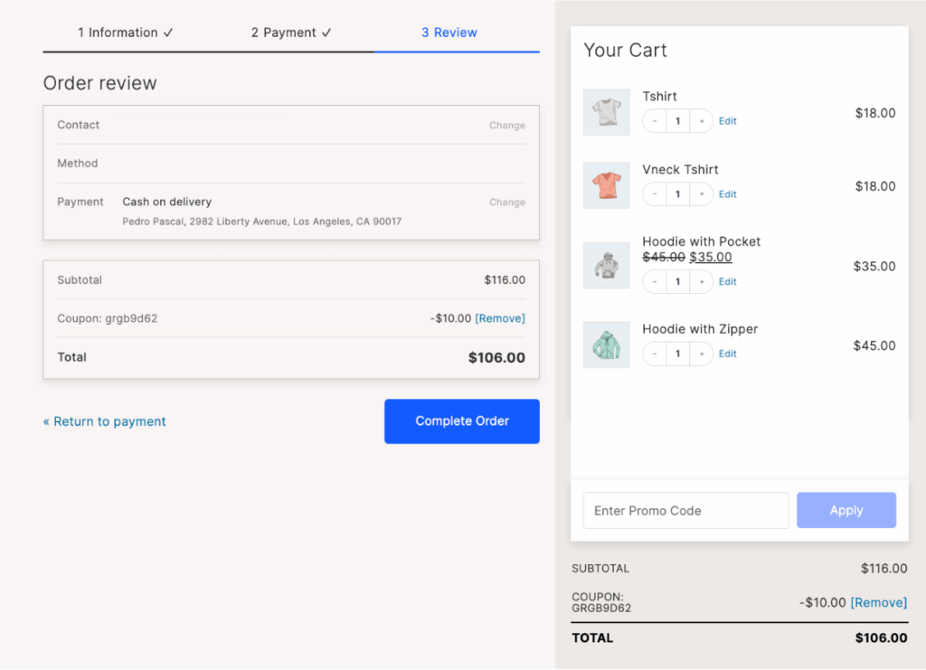
Decide how many steps your checkout flow needs
Checkout flow structure is the number of pages or sections customers navigate to complete their purchase.
There’s no universal “best” approach – only what works for YOUR customers.
Here’s a quick comparison
| Checkout type | Best for | Advantages |
| One-page checkout – quick and easy | Simple products Repeat customers Digital goods Low cart values Mobile-heavy audiences | No page load delays Everything visible upfront Faster for returning customers Single “Complete Order” action |
| Multi-step checkout – breaks the process into logical sections across multiple pages. | Complex products requiring configuration High-value purchases ($500+) First-time customers B2B transactions Extensive form requirements | Less overwhelming Clear progress tracking Grouped related fields Error isolation by section |
CheckoutWC offers both one-page and multi-step layouts — switch between them with one click to test what converts better for your audience.
Your analytics will reveal the truth:
- High abandonment rate on page 2? Try one-page.
- High abandonment rate immediately? Try multi-step.
- Mobile traffic dominant? Lean toward one-page.
- Selling to seniors? Multi-step often wins.
Still, whether one-page or multi-step, these elements are non-negotiable:
- Progress indicators showing completion.
- Clear section dividers.
- Logical field grouping.
- Consistent navigation.
- Mobile responsiveness.
The CheckoutWC solution
Besides letting you control the number and appearance of fields, you’re also able to switch between multi-step and one-page checkout.
With the one-page option, customers see everything upfront – no surprises, no back buttons, no lost progress.
With the multi-page checkout, you can add an order summary page and style the steps to fit your brand and guide your customers through the process.
Use a clean design and keep it simple
Clean checkout design is the visual arrangement that removes all unnecessary elements, focusing customer attention solely on completing their purchase.
Cognitive load theory shows humans can only process 5±9 pieces of information simultaneously. Your checkout already demands:
- Payment details
- Shipping info
- Order total
- Security concerns
- Delivery timeframe
That’s already pushing limits before adding a single distraction.
So, how do you decide what stays and what goes? Here’s what we recommend:
| Keep | Remove |
| Order summary | Navigation menu |
| Form fields | Social media links |
| Security badges | Live chat popups |
| Progress indicator | Newsletter signups |
| Primary CTA | Related products |
| Price breakdown | Promotional banners |
Another important rule of design is visual hierarchy: Your primary CTA should be:
- 20% larger than secondary buttons.
- In high-contrast colors (green/blue perform best).
- With a descriptive text (“Complete Purchase” beats “Submit”).
That clear language applies to every other copy on the page: Instead of “Continue,” write “Proceed to Payment” or “Review Your Order” – users need to know exactly what will happen when they click a button.
Another way you can help is by including smart defaults that eliminate thinking:
- Pre-select the most common shipping option.
- Auto-check “billing same as shipping.”
- Hide optional fields behind “Add a note” link.
- Display only essential payment methods.
Use checkout progress indicators to guide checkout
Progress indicators are visual elements showing customers their current position and remaining steps in the checkout process. They are an essential part of checkout because the biggest conversion killer is uncertainty. When customers don’t know how many steps remain, anxiety builds:
- “Is this going to take forever?”
- “What information will they ask for next?”
- “Should I grab my wallet now or later?”
Progress indicators eliminate the unknown.
Here’s what you need to do:
- Label steps with outcomes, not actions: Instead of “Step 1,2,3” be descriptive – Shopping cart, Delivery info, Payment method, Order Complete.
- Use visual styles that work:
- Progress bar (best for 2-3 steps) [====|——-|——-] 33% complete
- Numbered steps (best for 3-5 steps) ① Cart → ② Shipping → ③ Payment → ④ Done
- Breadcrumbs (best for flexibility) Cart > Shipping > Payment > Confirm
- Use strategic positioning: Top of page placement wins — customers check progress before scrolling.
- Use collapsed indicators for mobile: “Step 2 of 4: Shipping” expands to full view on tap.
🤔Did you know? The Zeigarnik Effect means people feel compelled to complete tasks they’ve started. Each completed step strengthens this psychological pull.
The CheckoutWC solution
With CheckoutWC, you can include free shipping progress indicators matched to your chosen checkout style.
Offer multiple payment options
Payment options are the different methods customers can use to complete their purchase, from traditional cards to modern digital wallets. 58% of customers abandon checkout when their preferred payment method isn’t available, so make sure you accommodate your target audience.
Customer payment preferences vary by:
- Age (Gen Z loves digital wallets).
- Location (Germans prefer bank transfers).
- Device (mobile users want one-tap options).
- Purchase size (BNPL for expensive items).
And here are the most common options globally: Credit/Debit, PayPal, Apple/Google Pay, Buy Now, Pay Later, bank transfers. However, if you have international customers, you need to adapt to their preferences. Some examples include iDEAL in Netherlands, Alipay in China, Interac in Canada, and PIX in Brazil.
Here are some other best practices:
- Display methods in usage order:
- Most popular first (usually cards)
- Express options prominent on mobile
- Alternative methods visible but secondary
- Display payment logos even before selection:
- Visa, Mastercard, Amex icons
- “Secured by PayPal” badge
- “Apple Pay” button styling
The CheckoutWC solution
All checkout templates include an express payment integration:
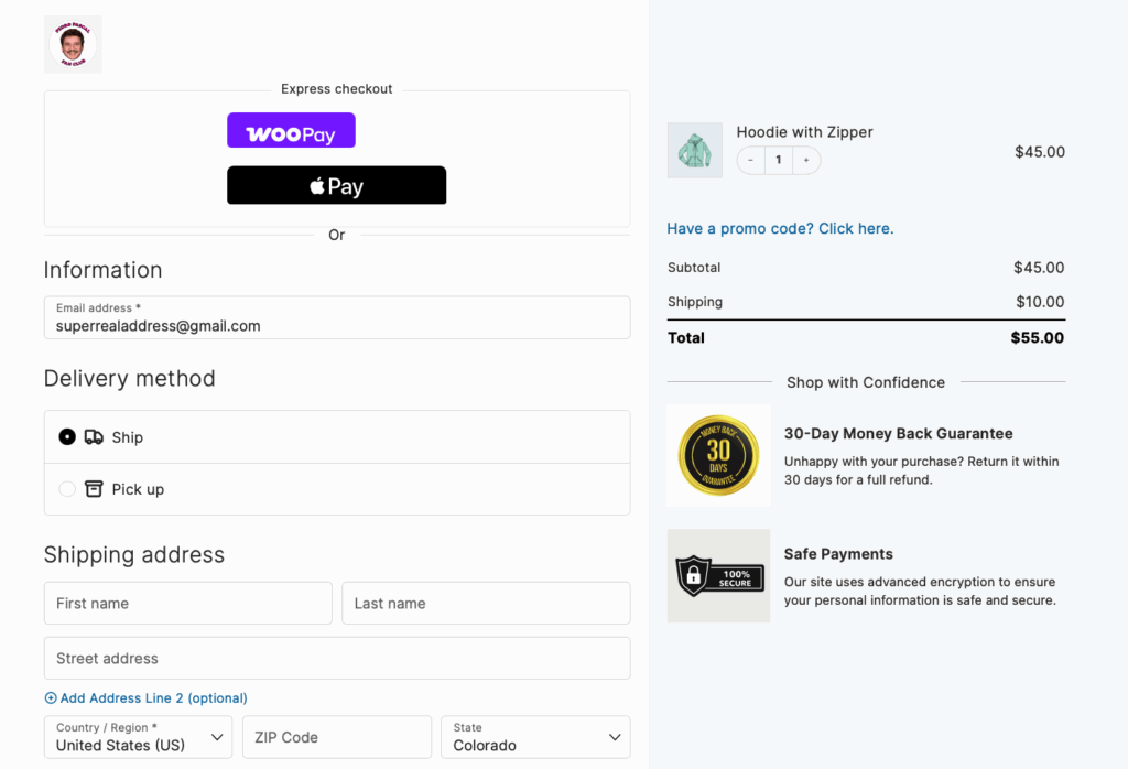
And full support for various other payment methods:
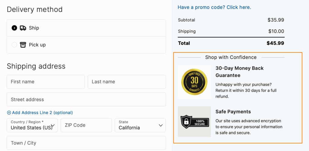
Display trust badges
Trust badges are visual security indicators that reassure customers their payment information and personal data are protected. The most common ones are:
- SSL certificate lock icon
- Norton Secured seal
- McAfee SECURE badge
- Payment method logos (Visa, PayPal)
- Money-back guarantee
- Industry certifications
- Customer reviews/ratings
- BBB accreditation
- Years in business
However, that doesn’t mean that you should just slap 10 badges on the page and call it a day – be selective and place them strategically.
- Position recognized security badges (SSL, Norton, McAfee) directly next to payment fields where customers enter sensitive information.
- Display payment method logos prominently to leverage established brand credibility — seeing familiar Visa or PayPal logos reduces hesitation.
Do the same in your the mobile version but just make sure that the badges are within thumb-reach zones where one-handed users naturally look.
Besides that, make policy links (privacy, returns, guarantees) accessible without leaving checkout through modal popups or expandable sections.
The CheckoutWC solution
CheckoutWC’s built-in trust badge integration enables customizable placement throughout your checkout flow, displaying security certifications and payment logos automatically without development work.
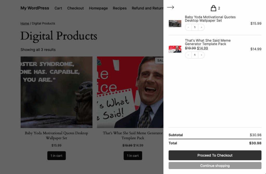
Improve cart management and abandonment
Cart management and abandonment prevention is the strategic approach to keeping customers engaged from cart addition through post-purchase, reducing the 70% average abandonment rate.
- The moment customers complete their purchase, anxiety peaks. Will the order go through? When will it arrive? Immediate confirmation emails (within 60 seconds) containing order details, payment verification, and next steps eliminate this uncertainty. Include multiple support channels in every communication to provide instant reassurance.
- Transparency throughout fulfillment keeps customers engaged rather than worried. Multi-stage notifications — from “we’re packing your order” to “out for delivery today” — combined with real-time tracking create anticipation instead of anxiety. When delays occur, proactive alerts with explanations prevent frustration and reduce support inquiries.
- Post-delivery engagement seals future sales. Time review requests for 24-48 hours after delivery when satisfaction peaks. Recommend complementary products based on what they bought (running socks for shoe purchases), include social sharing incentives, and establish balanced follow-up sequences that nurture without annoying.
The CheckoutWC solution
Include a smart side cart that gives users real-time updates without page refresh:
- Running total with taxes/shipping
- Quantity adjustments
- Coupon application
- Stock warnings
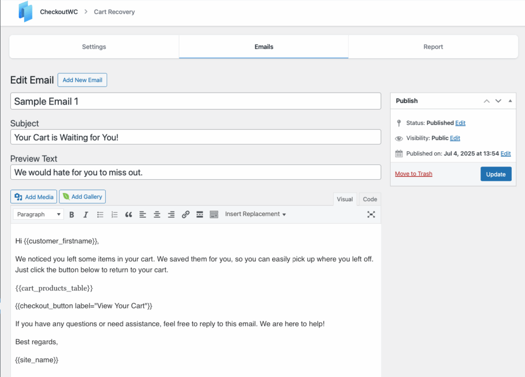
You can also track abandoned cart recovery with a special dashboard to monitor success.
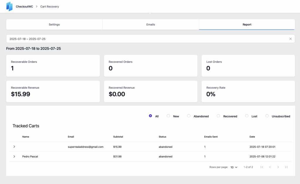
The email is captured after the first field completion, and if the cart is abandoned, the automated recovery sequence will send out a series of customized emails to win back the user.
Take your checkout optimization to the next level
Every optimization technique you’ve just learned – from removing unnecessary fields to displaying trust badges – directly translates to revenue.
But here’s the truth: Checkout optimization never stops.
Customer expectations shift, payment methods evolve, and mobile usage grows. What converts today might frustrate customers tomorrow.
That’s why CheckoutWC exists. Instead of manually implementing dozens of best practices, you get them all instantly. One plugin transforms your standard WooCommerce checkout into a conversion machine – complete with one-page flows, mobile optimization, express payments, and abandoned cart recovery.
Your customers deserve a checkout experience that respects their time and builds their confidence. Install CheckoutWC now and give your customers the frictionless purchase experience they expect.
The simplicity of Shopify with the power of WooCommerce. Replace your WooCommerce checkout page with CheckoutWC to boost sales and reduce cart abandonment.